BEE & TEA
A boba tea, smoothie, and bao shop specializing in Taiwanese boba milk tea beverages in a variety of flavors.
̌

Naming, logo design, and color palette exploration for Bee & Tea, a boba tea and bao shop concept by Forever Brands that opened in 2014.
“Bee” is a play on the honey used to sweeten the boba pearls, and “Tea” is a direct representation of what was served—Taiwanese tea, among other beverages.
The bee mark is synonymous with honey, and a whimsical and fun addition to the logo. The colors are bright, jovial, and attention grabbing, while not being too alarming.

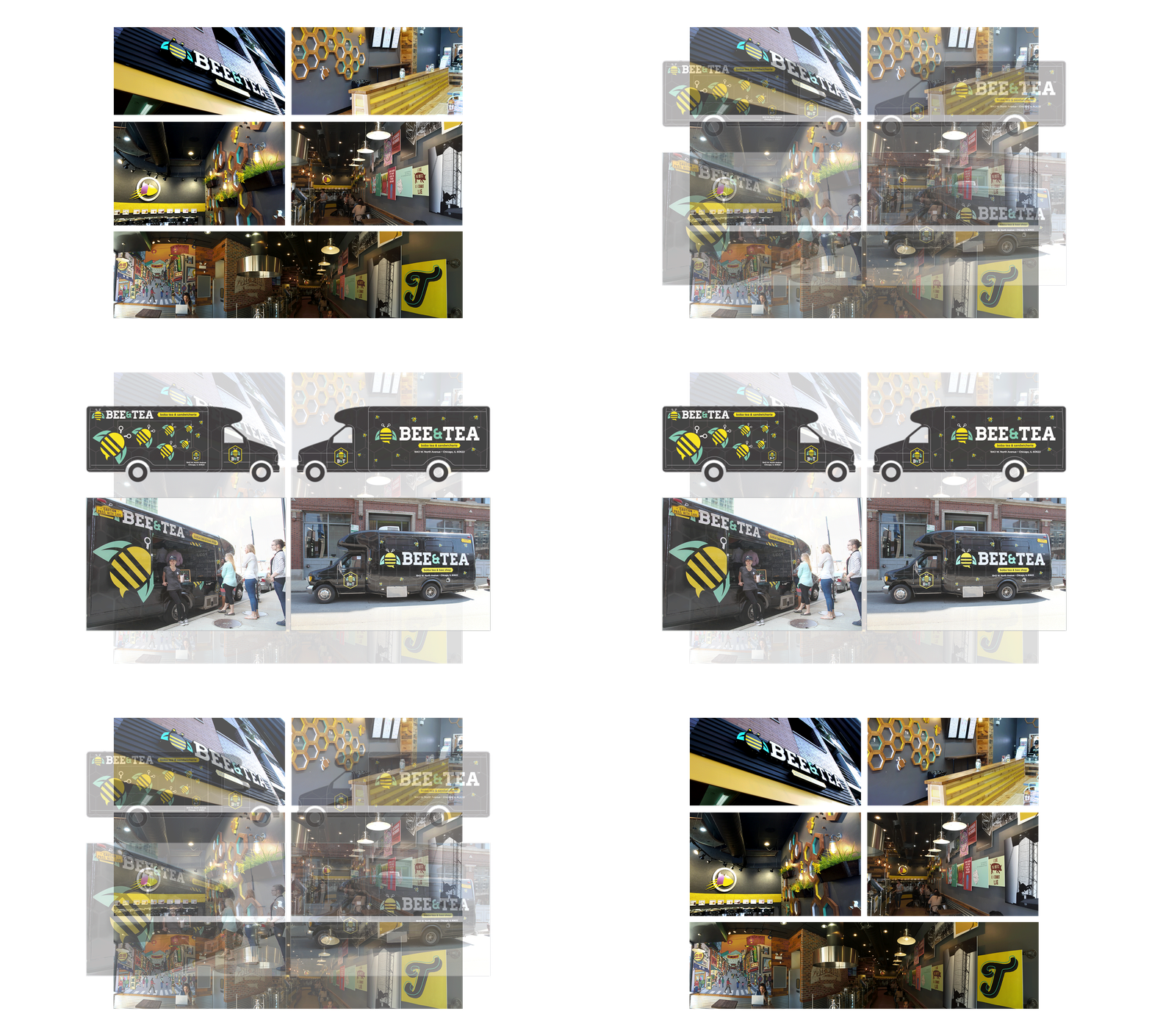
While working collaboratively with the site developer, the design team concepted and designed in-store elements for two Chicago locations (the first Bee & Tea locations), as well as for the Buzz Truck—Bee & Tea’s “food” truck.

Working collaboratively with the design and marketing teams, a dynamic website was designed to showcase the concept shop, as well as offer information on franchising.
The site featured menus, nutritional values of the offerings, location finder, franchise information, and a sign up for an email list.

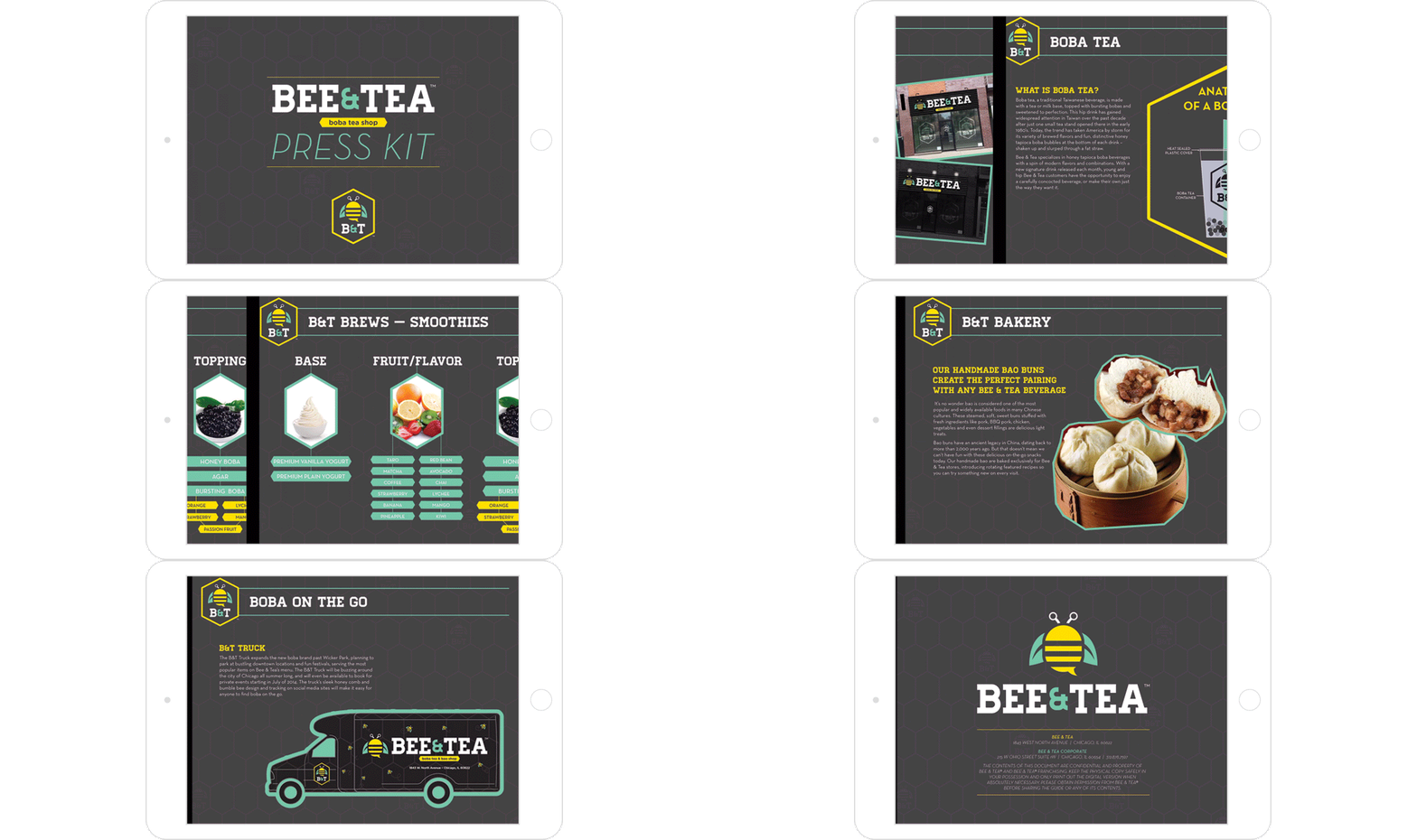
To market the new shop concept, a Press Kit was created. The purpose of this press kit was to be able to quickly get important information regarding Bee & Tea into the hands of those who wanted it and to do so quickly.
The Press Kit covered several topics, including the history behind boba tea and baos, what the shop offered, franchise investment and return information, and further contact information.

For the Fullerton location, digital TV menu boards were utilized in order to quickly change out menu items if need be, and to rotate seasonal items with ease. All products were made, food styled, shot, and edited in-house.

For the Bucktown location, TV menu boards were utilized with static screens. The purpose of these menu boards were to educate the customer on how to order and how to easily navigate through the several flavors, toppings, and add-ons the shop offered.


